Be direct.
Say what people can do and where the action goes. Cleverness comes after clarity.
Quest brand system · Lagos
A living system for helping people find somewhere worth going. Warm, direct, lively—and always grounded in real places and real people.
Simple words. Real invitations.
Real Lagos over invented worlds.
Purposeful movement, never theatre.
01 · Foundations
Neutral surfaces carry the experience. Orange marks action. Amber adds a spark—not another competing button color.
--quest-ink
#1A1512
--quest-paper
#FBF7EF
--quest-canvas
#F1EADD
--quest-action
#C94A1F
--quest-spark
#F0A03B
--quest-ink-soft
#554B43
Typography
DM Sans carries every role. Hierarchy comes from scale, weight, spacing, and contrast—not from mixing typefaces.
Go somewhere.
Pick what feels fun.
There is always something worth doing.
Find fun activities nearby, join people who are in, or start your own plan. The copy stays plain enough to understand on the first read.
Spacing
A 4px base keeps product layouts precise while preserving generous editorial rhythm.
12346812182402 · Components
Controls use familiar shapes, visible states, and honest labels. Expressive styling never obscures what happens next.
QuestButtonOne primary action per view. The hard shadow belongs to the main action—not every surface.
QuestTagSection eyebrow
Useful context, not decoration.
QuestFieldUse an area, landmark, or neighbourhood.
Enter a complete email address.
System signalsSaved to your list
You can come back to it anytime.
Plans can change
Confirm with the venue before you go.
Could not save this
Check your connection and try again.
03 · Photography
Use specific, recognisable places and human moments. Avoid synthetic scenes, empty lifestyle gloss, and images that could be any city.
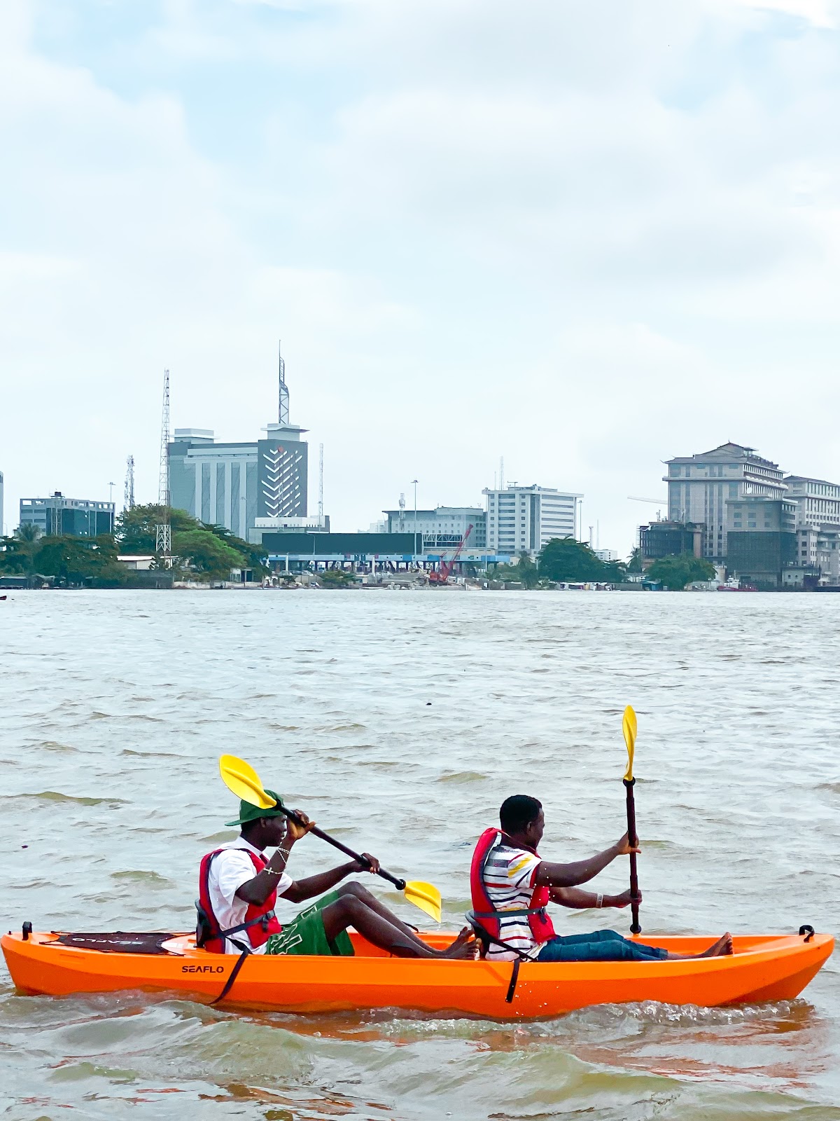 Real place
 Real setting
Specific Lagos places
Landmarks, venue texture, recognisable streets, water, food, art, and people in motion.
Close enough to feel present
Keep the activity legible. Avoid distant, empty scenes and cluttered collages.
Sharp editorial frames
No soft card radii. Reserve the offset shadow for featured imagery.
04 · Principles
Say what people can do and where the action goes. Cleverness comes after clarity.
Use Lagos with specificity and respect. Real places beat generic lifestyle imagery.
Editorial marketing can be loud. Product screens should quieten down and help people choose.
Do
Avoid
The standard